
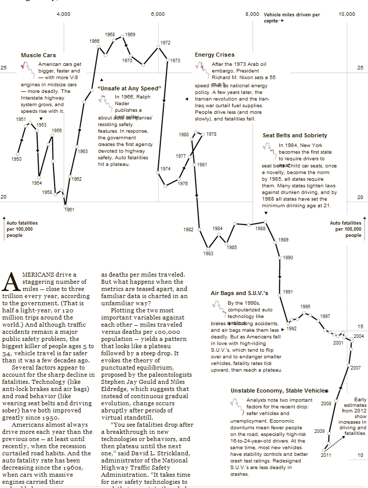
The New York Times created a meandering plot on the relationship between road fatalities and miles driven in the United States. The per capita miles driven has doubled since 1968, but the number of deaths per 100,000 people has fallen roughly 60 percent.
The diagram is essential a scatterplot, with a line connecting each point and every year is labelled. The reader is then able to spot the trends in three dimensions: the trend in miles driven; the trend in death rates; and how that corresponds to time.
A common theme in practical, helpful graphs is a narrative interwoven with the diagram. Moreover, the approach showing the relationship of per capita miles and per capital deaths shows an interesting—and sometimes expected, for the lay reader—trends in the data. Often, these trends correspond to technological (e.g., brakes) and economic (e.g., gas prices) factors. Without that narrative, the reader would be left to conjure his own incorrect hypothesis.